PRODUCT DESIGN / USER RESEARCH / HUD DESIGN / MOTION GRAPHICS
NS OnTrack - An adaptive window-projected HUD
Designing a responsive experience for train drivers, during the most crucial moments.
About the project
Tasks UX research, UI design
Client NS
Duration Sept 2025 - Jan 2026
Team dynamic Student team consisting of five & two projectpartners
The context
NS is the Netherlands’ largest consumer-based train company, with up to 5.200 train rides per day. This calls for punctuality, safety, and efficiency. NS asked us, a team of 5 UX/UI students, to research and design further upon their current system, TimTim Pro, a software in the train that shows the train driver when to release the gas and save energy, and to respond to other trains in their surroundings.
It’s a very precise system, but NS found out not all train drivers are using it, so it was up to use to improve the system according to the train driver’s needs. However, how do you design a system for such crucial moments, without actually being able to speak to a train driver?
The research
A train driver’s most crucial tasks
At the start of the project, our goals was to become familiar with the work of a train driver. We learnt that immersing ourselves into their work as much as possible would create understanding and empathy for them and their work.
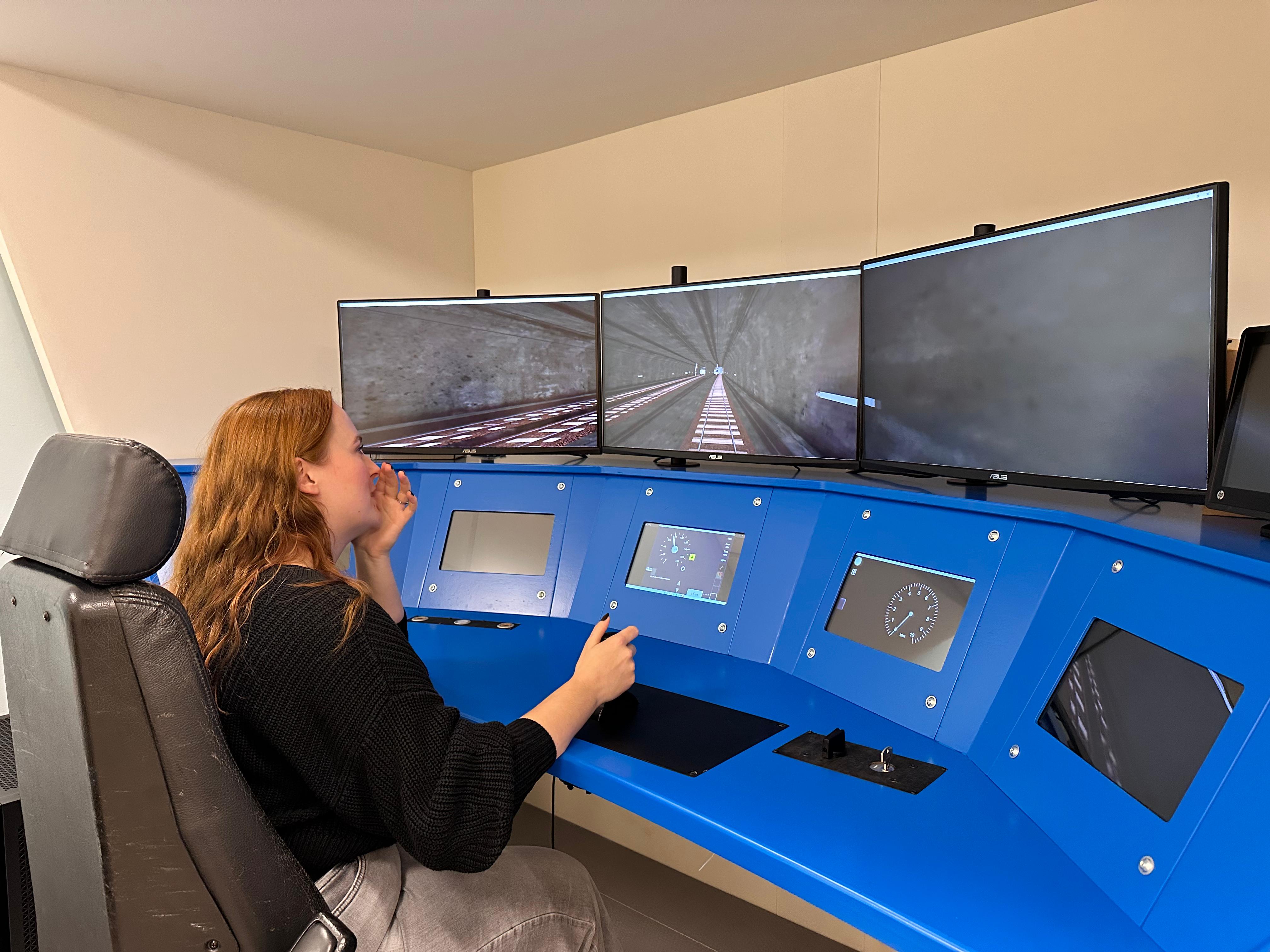
During the research phase, we were unable to directly speak with train drivers, our target audience. To immerse myself in their work anyways, I watched train driving POV videos, talked to our projectpartners who do know a lot about the train drivers, and looked through NS information websites and forums. I even got to ‘drive’ a train at the NS train simulator facility.
It still didn’t give us a direct insight into what our target audience thinks is important, but it allowed us to understand their daily tasks and made it easier to see the urgency and dangers of their work. It also helped us immerse into what it means to be a train driver.
We collected three key insights during our research phase:
Responding to delays
The train driver wants to receive the right information early on in order to be able to proactively respond to prevent delays.
Anticipating delays can not only help them drive on time, but also creates the opportunity to assist other trains on the track where possible.
The dangers of boredom
The train driver wants to be stimulated during calmer periods and needs support during the busy moments of the journey.
When the driver knows their route well, they mentally run on autopilot - a danger during the most crucial moments.
Respect for workmanship
The train driver’s workmanship is the core to their job, and needs to be visibly appreciated, so that their intrinsic motivation increases.
Experienced drivers, in particular, can be skeptical: they rely on their own knowledge of the route and train.
Designing content-first: What information does the train driver actually need?
Deciding the content
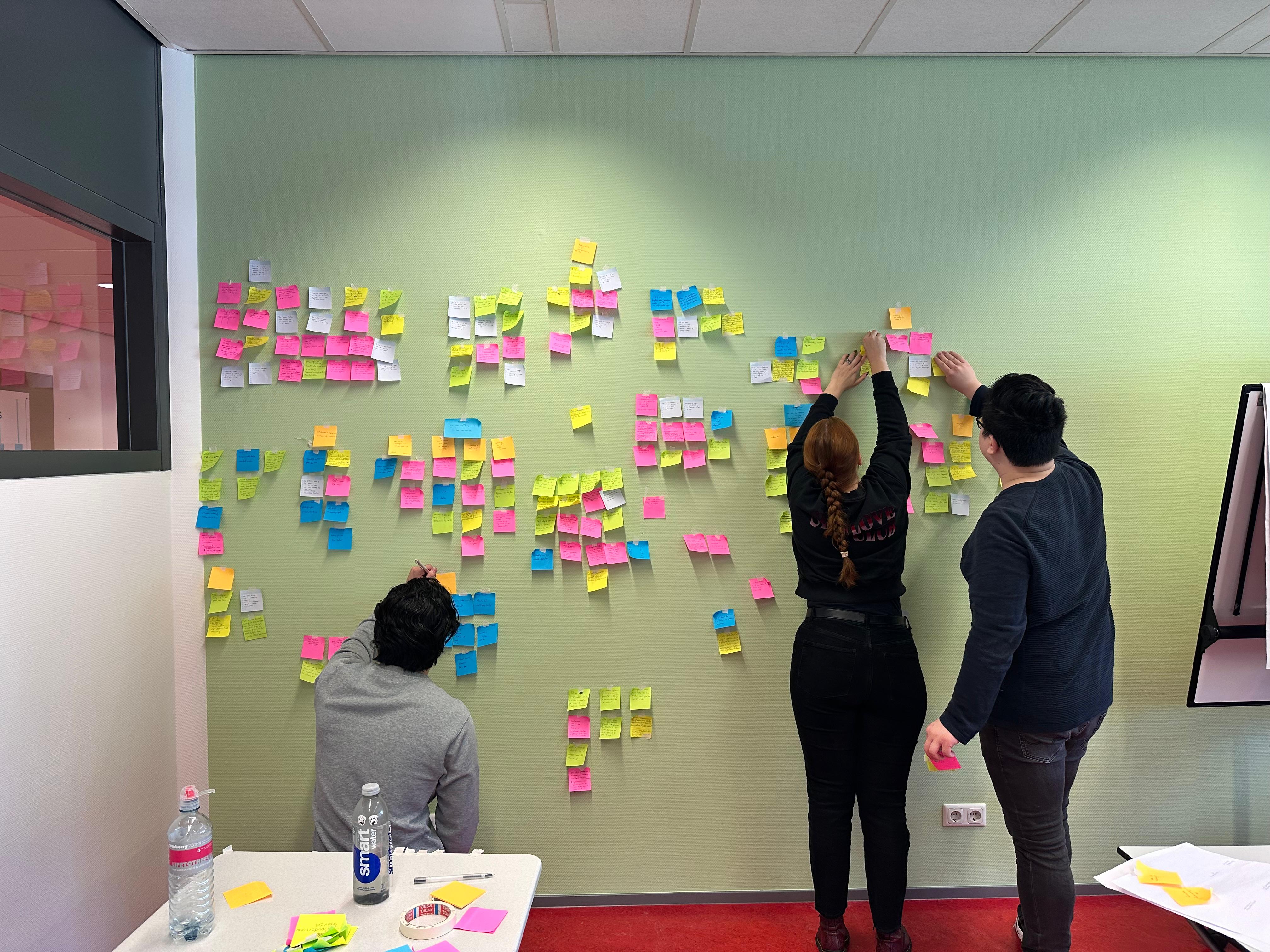
Based off of both the content of the current TimTim Pro and talks with UX designers working closely with the train drivers, we collected a list of possible content for the product. To present this to the UX designers of NS, we made an infographic of our ideas, and discussed our insights with them with the use of sticky notes.
Based off of this discussion we made a list of content for within our product, and outside of it. For example, real-time indications of where to release gas would need to be within the HUD projected on the window. Information about the whole ride, the current track and the train itsself needed to be on a seperate screen - not directly in view but always visible.
“Being aware of the train drivers field of view is critical to designing the HUD.”
Innovative technology to support the train driver
A window-projected HUD
While talking to the UX designers of NS and during several brainstorming sessions we designed our product: A HUD projected in the train window, supported by an LED screen below. We designed the HUD in a set workflow:
Charting User Flows
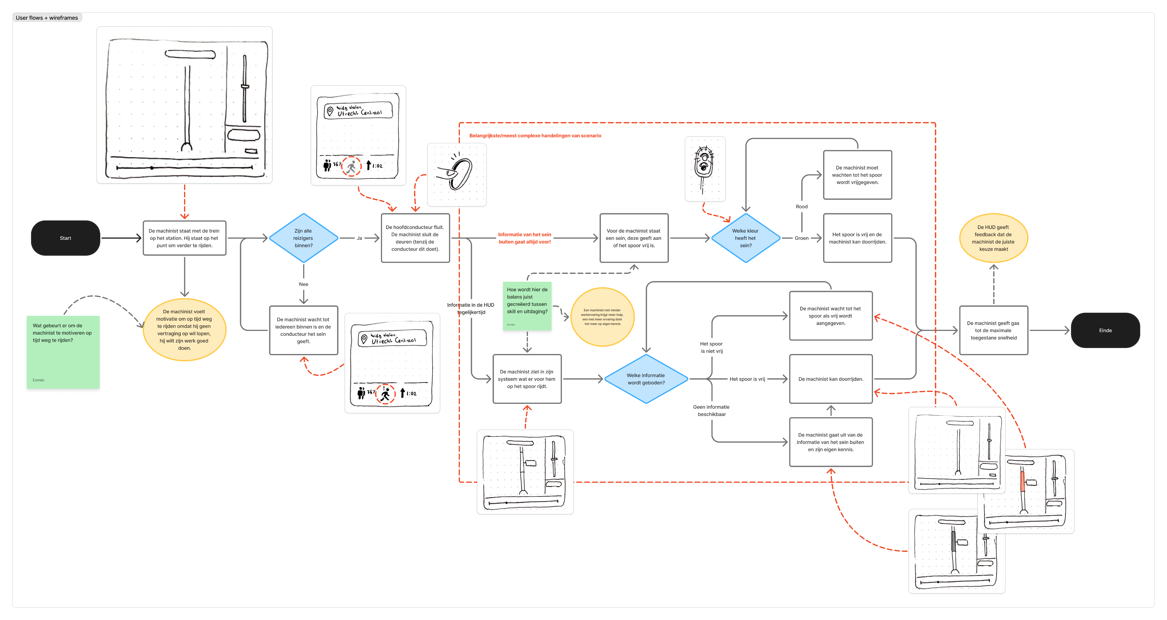
Starting with low-fidelity sketches helped us design various user flows for the product. We sketched these base off of user goals and situations relevant to the final product, such as leaving a train station on time.
I kept the train drivers choices central in the user flows, since those are critical to their driving behaviour.
A single-screen HUD
Before we decided on having the HUD central in the train’s window, we had a single-screen HUD, showing the same information but in one central place.
I added a progress bar showing the whole route including train stops and obstructions. Visibility is something the drivers requested, they feel more in control that way.
With the NS UX-team we decided against a single-screen HUD, as it was too similar to what the TimTim Pro already is, and because it would be out of the driver’s field of view too much.
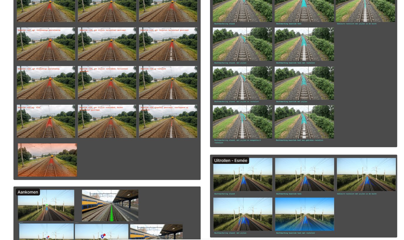
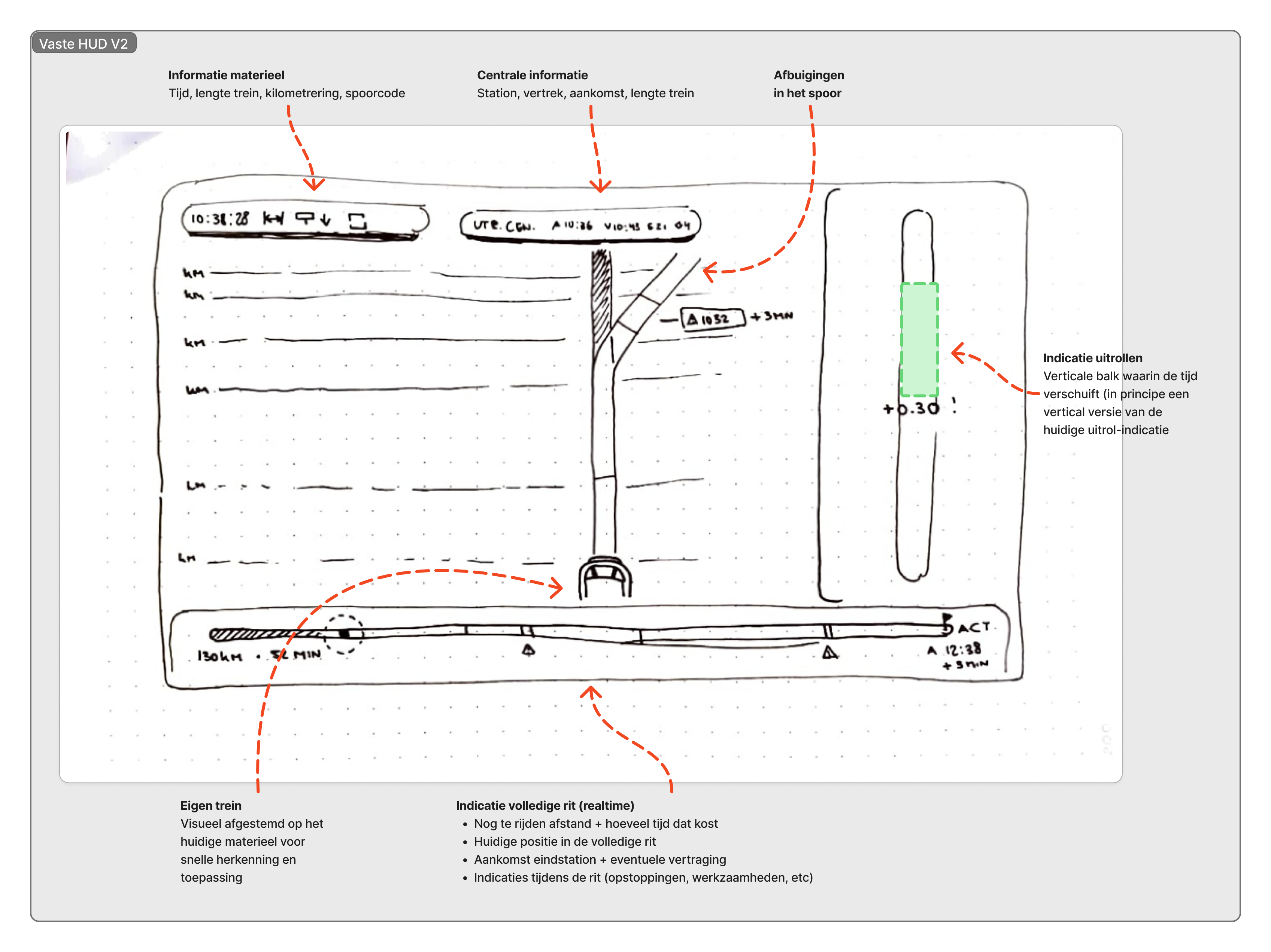
Building in-screen visuals
After deciding to make a window-HUD instead, with only the most critical information visible, we went to designing the content. We designed visuals that would show information on the rails, from obstructions to bends, and most importantly information about the next train station and moments of rolling out.
I designed using bright colors and smooth transitions, so the information wouldn’t be jarring or distracting, but feel natural and easy to use.
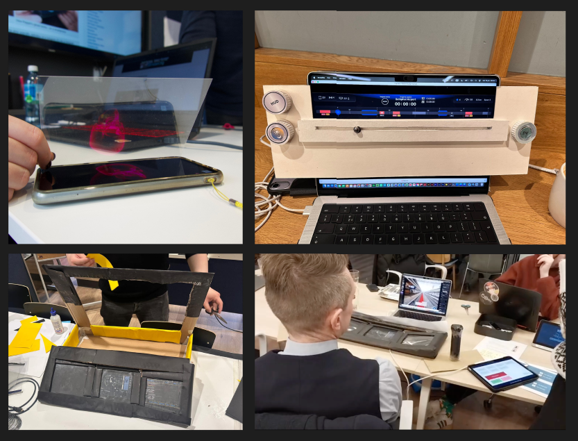
Paper prototyping a train steering post
To test whether the window-HUD would actually work, we made a paper prototype of the steering post, reflecting the animated HUD into the window using a Pepper’s Ghost effect.
During the final phase we we’re able to test with a train driver, and using the paper prototype helped with immersion and understanding the HUD in context.
Presenting the OnTrack to NS
The final product
Our user test led us to making the final decisions for the content of our product. We learned where in the window critical information would and would not obstruct the train drivers view, and we learnt which information was actually critical.
The final product consists of an in-window HUD and a separate LED screen. The HUD contains the most critical information, always in view, and always in real-time. The LED-screen shows supporting information, which the train driver can consult during moments of rest.
One of the things I learnt was how even when the UX designers work so closely with the train drivers, their idea of what the user wants is still really different from what the user says they want.
What were the most insightful moments?
Reflection
Because of all the set conditions - from having no train drivers to speak with until the end, to having to design a product for information you don’t really know how to process - this project was really difficult.
However, I learnt a lot, about both designing for a target audience like this, as well as about designing a HUD. Not being able to talk to a train driver drove me to immerse myself as deeply into their workspace as possible, something which I’d never done before. It was very educational, even when it was hard.
Understanding which information was actually the most critical was the hardest part. Though we could learn from the current software’s content and the information the NS UX team gave us, it would’ve been more helpful to talk to the train drivers earlier in the design proces. Sometimes that’s just not possible, however, and I think immersing myself into their work and craftmanship as much as possible helped despite this.
In the future I would like to research more about designing the actual HUD. I took a lot of inspiration from similar designs and products, but I’m interested in the psychology why those HUDs look the way they do. This helps me be more conscious about my own design choices too.
View other case studies
The Sims 4 Companion App
Designing a companion app to the Sims 4, for organization and tracking.
View case study
Zyra’s Light
Researching and designing different ways for the player to select a Light mode when using Zyra’s Lantern in the game Zyra’s Light.
View case study
PRODUCT DESIGN / USER RESEARCH / HUD DESIGN / MOTION GRAPHICS
NS OnTrack - An adaptive window-projected HUD
Designing a responsive experience for train drivers, during the most crucial moments.
About the project
Tasks UX research, UI design
Client NS
Duration Sept 2025 - Jan 2026
Team dynamic Student team consisting of five & two projectpartners
The context
NS is the Netherlands’ largest consumer-based train company, with up to 5.200 train rides per day. This calls for punctuality, safety, and efficiency. NS asked us, a team of 5 UX/UI students, to research and design further upon their current system, TimTim Pro, a software in the train that shows the train driver when to release the gas and save energy, and to respond to other trains in their surroundings.
It’s a very precise system, but NS found out not all train drivers are using it, so it was up to use to improve the system according to the train driver’s needs. However, how do you design a system for such crucial moments, without actually being able to speak to a train driver?
The research
A train driver’s most crucial tasks
At the start of the project, our goals was to become familiar with the work of a train driver. We learnt that immersing ourselves into their work as much as possible would create understanding and empathy for them and their work.
During the research phase, we were unable to directly speak with train drivers, our target audience. To immerse myself in their work anyways, I watched train driving POV videos, talked to our projectpartners who do know a lot about the train drivers, and looked through NS information websites and forums. I even got to ‘drive’ a train at the NS train simulator facility.
It still didn’t give us a direct insight into what our target audience thinks is important, but it allowed us to understand their daily tasks and made it easier to see the urgency and dangers of their work. It also helped us immerse into what it means to be a train driver.
We collected three key insights during our research phase:
Responding to delays
The train driver wants to receive the right information early on in order to be able to proactively respond to prevent delays.
Anticipating delays can not only help them drive on time, but also creates the opportunity to assist other trains on the track where possible.
The dangers of boredom
The train driver wants to be stimulated during calmer periods and needs support during the busy moments of the journey.
When the driver knows their route well, they mentally run on autopilot - a danger during the most crucial moments.
Respect for workmanship
The train driver’s workmanship is the core to their job, and needs to be visibly appreciated, so that their intrinsic motivation increases.
Experienced drivers, in particular, can be skeptical: they rely on their own knowledge of the route and train.
Designing content-first: What information does the train driver actually need?
Deciding the content
Based off of both the content of the current TimTim Pro and talks with UX designers working closely with the train drivers, we collected a list of possible content for the product. To present this to the UX designers of NS, we made an infographic of our ideas, and discussed our insights with them with the use of sticky notes.
Based off of this discussion we made a list of content for within our product, and outside of it. For example, real-time indications of where to release gas would need to be within the HUD projected on the window. Information about the whole ride, the current track and the train itsself needed to be on a seperate screen - not directly in view but always visible.
“Being aware of the train drivers field of view is critical to designing the HUD.”
Innovative technology to support the train driver
A window-projected HUD
While talking to the UX designers of NS and during several brainstorming sessions we designed our product: A HUD projected in the train window, supported by an LED screen below. We designed the HUD in a set workflow:
Charting User Flows
Starting with low-fidelity sketches helped us design various user flows for the product. We sketched these base off of user goals and situations relevant to the final product, such as leaving a train station on time.
I kept the train drivers choices central in the user flows, since those are critical to their driving behaviour.
A single-screen HUD
Before we decided on having the HUD central in the train’s window, we had a single-screen HUD, showing the same information but in one central place.
I added a progress bar showing the whole route including train stops and obstructions. Visibility is something the drivers requested, they feel more in control that way.
With the NS UX-team we decided against a single-screen HUD, as it was too similar to what the TimTim Pro already is, and because it would be out of the driver’s field of view too much.
Building in-screen visuals
After deciding to make a window-HUD instead, with only the most critical information visible, we went to designing the content. We designed visuals that would show information on the rails, from obstructions to bends, and most importantly information about the next train station and moments of rolling out.
I designed using bright colors and smooth transitions, so the information wouldn’t be jarring or distracting, but feel natural and easy to use.
Paper prototyping a train steering post
To test whether the window-HUD would actually work, we made a paper prototype of the steering post, reflecting the animated HUD into the window using a Pepper’s Ghost effect.
During the final phase we we’re able to test with a train driver, and using the paper prototype helped with immersion and understanding the HUD in context.
Presenting the OnTrack to NS
The final product
Our user test led us to making the final decisions for the content of our product. We learned where in the window critical information would and would not obstruct the train drivers view, and we learnt which information was actually critical.
One of the things I learnt during this moment was how even when the UX designers work so closely with the train drivers, their idea of what the user wants is still really different from what the user says they want.
The final product consists of an in-window HUD and a separate LED screen. The HUD contains the most critical information, always in view, and always in real-time. The LED-screen shows supporting information, which the train driver can consult during moments of rest.
What were the most insightful moments?
Reflection
Because of all the set conditions - from having no train drivers to speak with until the end, to having to design a product for information you don’t really know how to process - this project was really difficult.
However, I learnt a lot, about both designing for a target audience like this, as well as about designing a HUD. Not being able to talk to a train driver drove me to immerse myself as deeply into their workspace as possible, something which I’d never done before. It was very educational, even when it was hard.
Understanding which information was actually the most critical was the hardest part. Though we could learn from the current software’s content and the information the NS UX team gave us, it would’ve been more helpful to talk to the train drivers earlier in the design proces. Sometimes that’s just not possible, however, and I think immersing myself into their work and craftmanship as much as possible helped despite this.
In the future I would like to research more about designing the actual HUD. I took a lot of inspiration from similar designs and products, but I’m interested in the psychology why those HUDs look the way they do. This helps me be more conscious about my own design choices too.